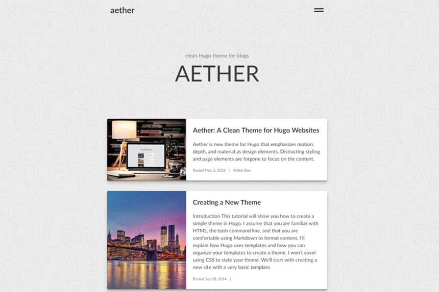
I’ve redesigned the website — to simplify, declutter, and emphasize the content and reading experience.
Table of contents
Why
The last couple of weeks, I’ve been working on a new design for the website. And by design, I mean finding, and modifying, a new Hugo theme. The reason I set out on this redesign journey was to peel away everything that didn’t emphasize the content and reading experience. I wanted a clean, minimalistic design, where the content was in focus.
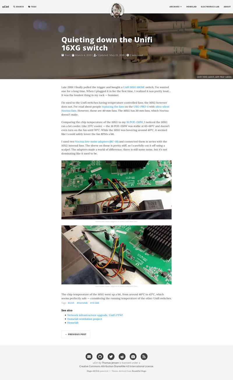
This is how the site used to look, with the old design.
Preparations
I first started by simplifying my old site to make the transition easier. The biggest change I did was to remove a rather complicated build process. I originally used a combination of Gulp and Bash scripts to build assets and resize images. I then uploaded videos to a separate CDN service before finally pushing the deployment.
It was just too complicated. I removed a few things I felt didn’t provide any value to the reader and switched from Gulp to using Hugo pipes instead. That dramatically simplified my build process 🙂 Then I started splitting sections of the layout, that I knew I wanted to reuse, into partials and shortcodes. This work was also valuable in the sense that it gave me a deeper understanding of the Hugo template system and content management.
Old deployment steps:
- Generate sized images in the content folder, with Gulp
- Build assets to the static folder, with Gulp
- Build Hugo
- Update assets revision references, with Gulp
- Generate sized images in public folder, with Gulp
- Minify HTML, with Gulp
- Upload videos to CDN, delete from the public folder
- Deploy
- Push index to Algolia
New deployment steps:
- Build Hugo
- Deploy
Searching
I spent about a week looking at Hugo themes — the way they were structured and how they looked. Doing this, I picked up a few ideas and tricks that I ended up implementing in my new design.
I wanted a theme that didn’t have a massive amount of CSS and scripting, like Bootstrap and jQuery. Then I found aether;
aether is a blog theme that emphasizes motion, material, and depth as design elements to highlight the content of your site.

My oh my! I had found my theme, time to make it “mine” 🙂 It’s hard to find something that leaves nothing to be desired. Luckily Hugo makes it very easy to override and add template elements.
Theme modifications
These are the things I have overridden in the aether theme, so far…
- Changed the feature image to use page resources and Hugo image processing.
- Removed
highlight.jsand used Hugo syntax highlighting instead. - Used tags instead of categories as taxonomy.
- Added read time, last modified and git info to pages.
- Added expandable table of content to posts, got the idea from Minimo.
- Removed usage of any external scripts and included them in Hugo pipes instead.
- Added SEO, favicon and canonical header information.
- Added fingerprinting to style and script assets.
- Made the header brand look like a Bash terminal, and added a blinking cursor, got that idea from Hello Friend.
- Added a 404 error page. (
Which is not active yet, due to a bug.Fixed!) - A few minor CSS tweaks here and there 🙂
You can see the website source code on GibLab.
Simplifications
As my goal was to simplify and improve the reading experience, I removed some elements of the previous design;
Inline photo galleries
The old design allowed me to inline photo galleries in my posts. There were some advantages to this; I would put more images into the text without them taking up too much space. However, it felt disruptive to the reading experience, as the images were too small to provide much detail. The user had to click them — interrupting and taking focus away from the post itself. So instead; I plan on using bigger images and drop those that don’t provide any valuable context. I feel this will allow for a more continuous reading experience 🙂
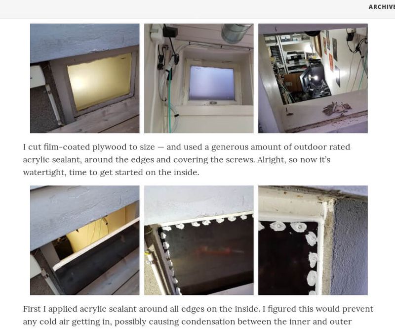
Two inline galleries in a post, each with three images.
Algolia site search
The site search in the old design was a “search as you type” service from Algolia, which worked very well. However, I felt it introduced a bit of complexity — I had to generate and push a json index to Algolia each time I deployed. It was just one more thing that I had to test and keep updated. I did forget on a couple of occasions — causing it to return bad, or incomplete search results. Plus it was an external service; I like to keep those to a minimum, where I can. Instead, I just added a DuckDuckGo search field on the archives page, it does navigate away from the site, and onto DuckDuckGo.com to show the results, but I can live with that.
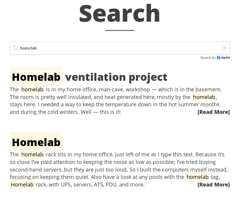
The old search page.
Image and video sitemaps
I used to have both images and videos in the sitemap, with captions. To pass the captions from the posts to the sitemap, they must be defined as page resource metadata, in the posts front matter.
resources:
- src: "images/IMG_20181105_193602.*"
  params: {caption: "Noctua low-noise adapters in series with 16XG fans."}
- src: "images/IMG_20181105_193616.*"
  params: {caption: "Noctua low-noise adapters in series with 16XG fans."}
I also used these metadata to show figure captions below the image. That was annoying for a couple of reasons;
- On some posts it made the frontmatter very long.
- I had to remember the correct syntax and get the
srcright. - It separated the shortcode, within the text, from the captions, in the frontmatter.
So instead I rewrote the figure shortcode to take the figure caption as an inner parameter, and just dropped the images and videos from the sitemap. I trust the search engines to find them anyways.
{{< figure "IMG_20181105_193602" "Fill" "800x400 center" >}}
Noctua low-noise adapters in series with 16XG fans.
{{< /figure >}}
Libraries
- Bootstrap
- Since the aether theme didn’t need Bootstrap, there was no longer any need for it. That’s a lot of CSS (and some JS) removed.
- Font Awesome
- Font Awesome is excellent; it really is. But I don’t use many icons, so I figured I’d use a few SVG icons and drop the library.
- jQuery
- My Photoswipe implementation still requires jQuery, but the aether theme does not. I’m planning to rewrite that and drop jQuery as well in the future.
- Algolia
- Since I’m no longer using Algolia, I could also remove
instantsearch.jsandatomic-algolia. - Gulp and NPM packages
- No Gulp means I could remove a whole bunch of NPM packages.
Lazy loading images
I also changed the way I lazy load images. Previously; I created very small and low-quality placeholder images, that I blurred up using the brilliant lazysizes library. Reading about lazy loading online, I found that some (a lot?) of people find it annoying. Since you have to wait a bit for the images to show on a slow or high latency connection.
Previous low-quality placeholder; 887 B, dimensions were only 10% of the embedded image.
I still lazy load with lazysizes, but I increased the quality and dimensions of the low-quality images and removed the blur up effect. That increases the initial page weight, but I feel it provides a much better experience. Now; the placeholder images are still good enough to see what it is. That means that the user doesn’t have to wait for the higher quality images to load when scrolling.
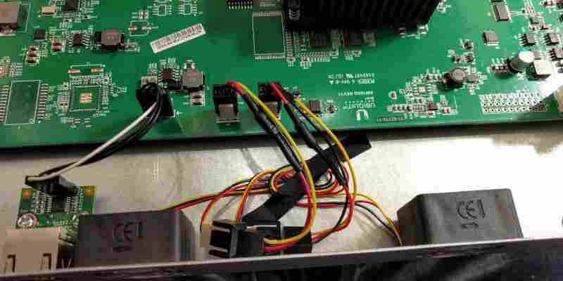
Current low-quality placeholder; 20.2 K, dimensions kept same as the embedded image.
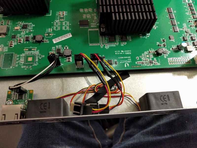
High quality embedded image; 73.6 K.
Clicking the images; the original image file opens in a lightbox. In this case; 574 K and dimensions 1600x1200.
I’ll write more about how I’ve implemented lazyloading, image processing, and image source sets in a future post.
Open-sourced
I have always meant to open-source this website; I just haven’t gotten around to it. Well — now I have. I just needed to clean some history first. I’ve pushed the source to GibLab and added change commit and source links to the bottom of all pages. Feel free to look, borrow, steal 🙂
Conclusion
So there you have it. I am thrilled with the way the new design turned out. I feel I accomplished my goal — to clear out distractions and let the content itself be the focus. It’s minimalistic and uncluttered, yet sufficient.
Perfection is achieved, not when there is nothing more to add, but when there is nothing left to take away. - Antoine de Saint-Exupery
I still have a bit of work left cleaning up and adapting some of the existing posts to the new design. However, I’m executing ./deploy for the website design 🙂
Last commit 2024-04-05, with message: Tag cleanup.
